List With Whit
BRAND IDENTITY | MARKETING COLLATERAL
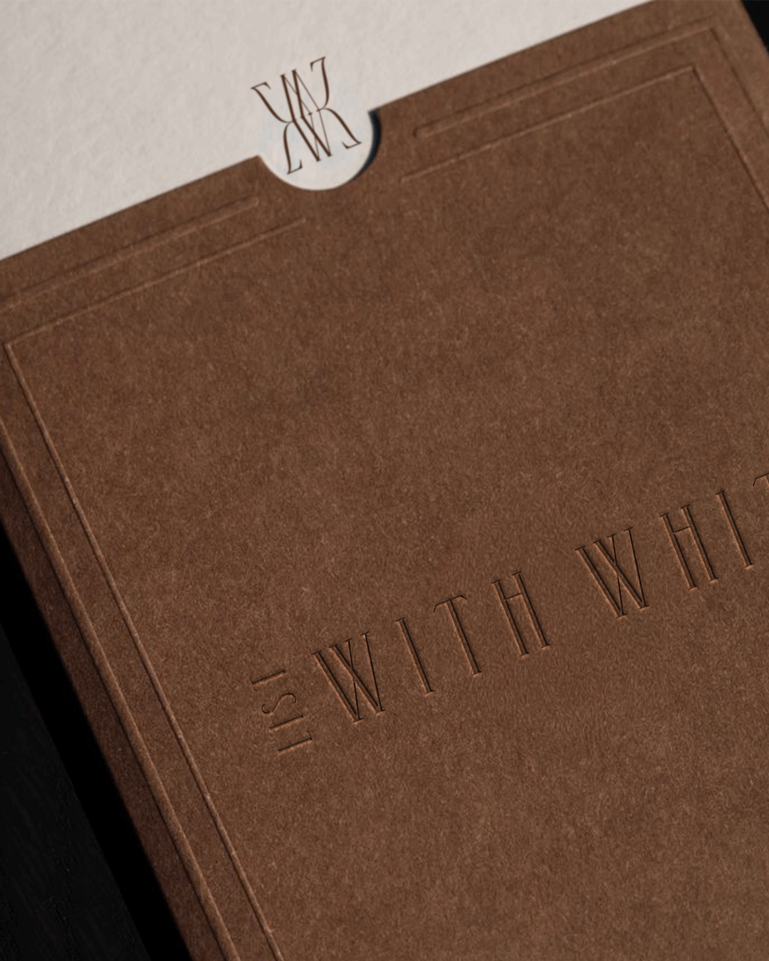
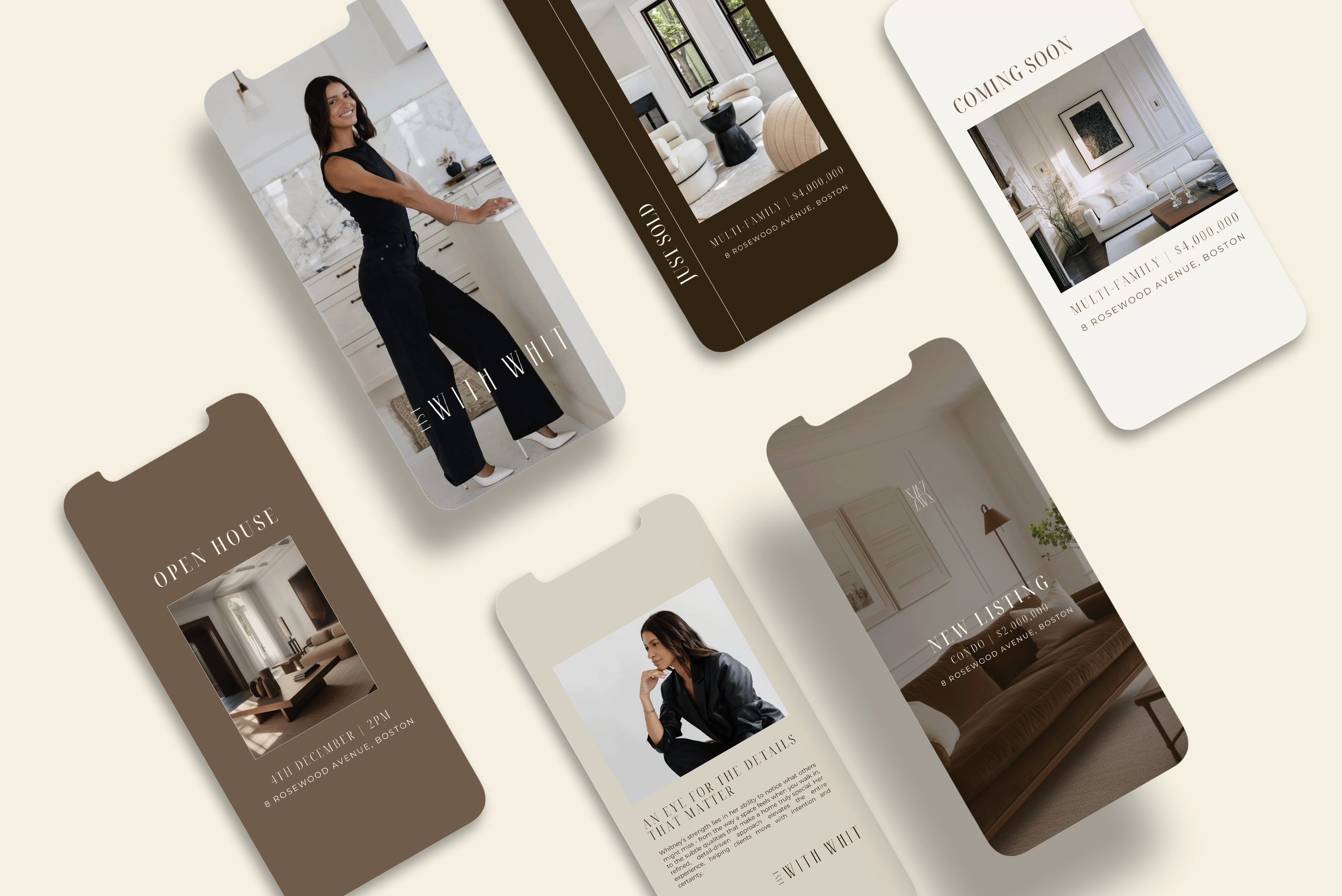
List With Whit is shaped by Whitney’s calm, considered approach to real estate - one that values lifestyle, design, and clarity just as much as market knowledge. She came to us looking for a brand that balanced warmth with an editorial feel. Our focus was on creating a visual identity that felt confident yet approachable, allowing her personality and way of working to come through naturally.

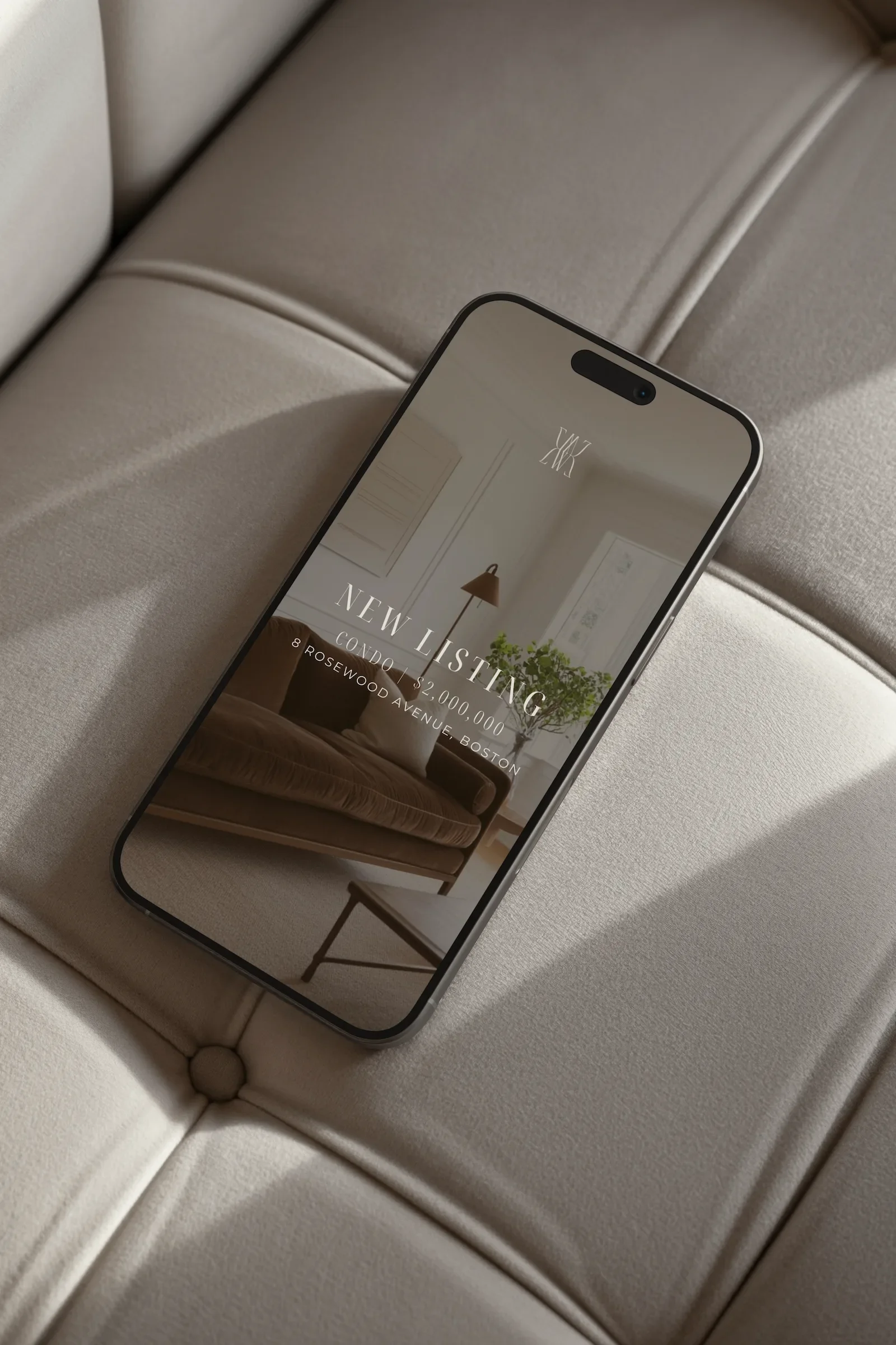
We developed a visual identity rooted in simplicity and balance, pairing refined typography with a structured monogram and a neutral, contemporary palette. Each element was designed to feel intuitive and consistent across platforms, creating a brand presence that feels grounded, trustworthy, and quietly confident - a natural reflection of Whitney as she continues to grow her presence within Boston’s real estate landscape.